|
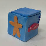
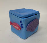
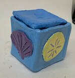
1. Art Criticism Process: ~ Describe the art work. List what you see in the art work. What images, art elements, and color schemes do you see? What images, art elements, and color schemes do you see? How would you describe it over the phone? ~ Analyze the art work. List various art elements and design principles such as color, value, line, shape, texture, space, balance, emphasis, harmony, variety, movement, proportion. ~ Interpret the art work. What is the mood and what feelings are being communicated? What ideas are being represented and what is the story being told? ~ Judge the art work. What do you think of the art work? Why or why not is it successful? Support your opinions with evidence. (Ar skills meaning, creative or realistic) 2. Critique: The project that I will be critiquing is my clay box. On the box there is a starfish, a sand dollar, a shell, and a fish. The color scheme is bright, with a mix of warm and cool colors. There is lots of emphasis on the shells and the fish because of the use of colors. The purple shell, yellow sand dollar, orange star fish, and red fish all pop on the blue box. The contrast of the colors also emphasizes the shells and fish. The lines on the shells, dots surrounding the star fish, and lines on the side of the fish make them look realistic. This piece is
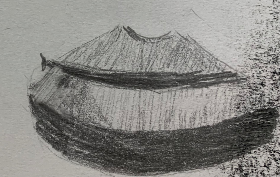
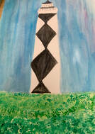
10. The project that I learned and developed the most from was the mixed medium project. It was fun to use different mediums and think outside the box. When I was in the midst of working on this project I realized I had been using lots of paper. I used tissue paper and computer paper. The piece looked good, but I wanted to add something else to make it more appealing. I added the jewels which changed the over look of the piece. It definitely made it more eye catching. This project made me feel creative and that I was open to so many different options. I feel that I learned from this project, because I found that using different mediums can add variety to a piece. After completing this project, I feel like I can step out of my comfort zone and try different mediums and techniques.  15. My most successful project was my bathing suit drawing done in pencil. I completed this piece for the drawing unit. I drew my bathing suit because my theme was the beach. I started off by lightly outlining the bathing suit and the flowers. I tried my best to make the flowers mirror each other on both sides. As I was working on the flowers, I added more detail, such as lines and dots. I also shaded some dark and some light so they would contrast. I shaded the edges of the bathing suit so it would look realistic. I added small detail to the criss cross tie at the top and the sides of the bottoms. This project was successful because the overall value and detail makes it realistic. 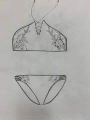 16. If given the opportunity I would do over the water color perspective project. I painted a lighthouse. Although there was lots of detail surrounding it, there was not any perspective. Perspective is creating an illusion of three-dimensions on a two-dimension surface. It makes a painting have form, distance, and look realistic. My piece does not have this, it is flat. If I did the project again, I would paint a city street with buildings along the street. I would have started off by outlining the street and then add the buildings. Next I would paint the sky and make it simple so the buildings would stand out more. I would add details on the buildings such as windows and signs. I also would have added details to the road such as lines, street signs, and a few trees. This project would be an example of one point perspective. I think that if I did this project a second time it could be more successful. 
0 Comments
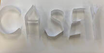 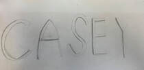 Process ~ First I cut out strips of paper and folded them to make my name. Then I glued them down on paper and started drawing the outline for my name. I tried to shade the letters to make them look as 3D as possible. Pros: Cons:
~the paper letters were easy ~some of the letters were difficult to draw to cut out and shape 3D ~the shading and shadows on ~gluing the letters on the paper was some of the letters look realistic difficult Process ~ First we cut out cardboard. Then we traced out the lady lightly with pencil. Next we painted the background. We mixed red and yellow to make an orange-red color on the left side. On the right side we mixed red and blue to make a dark purple. When the background was complete, we started painting the lady's dress white. Then we painted her hand brown and the apple red. Once the paint was dry we cut out the face, hair and neck outline. Finally, we made a stand so our piece would stand up for the art show. Pros: Cons: ~the paint colors were simple to mix ~we had a difficult time with the hot glue gun ~the lady's body and the colors looked very when we made the stand similar to the original piece ~we should have cut out the face before we painted 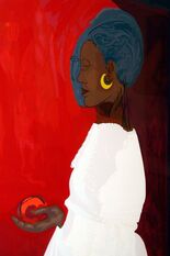 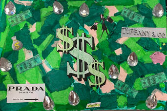 Detail Shots:
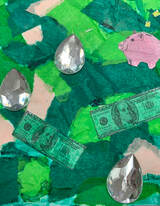
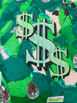
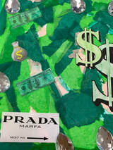
1. I used 5 different techniques. The first on I used was tissue paper. I used a mix of different shades of green and added a little bit of pink too. I printed out some clipart that went along with my theme. I painted the money with green watercolor and colored some of the pictures with colored pencil. I used jewels to add something that would stand out.
2. My word was wealth. I portrayed it by incorporating different things that represent wealth. I didn't just want to put money or dollar signs so I added the jewels and a few luxury brands. Warm-ups
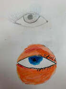
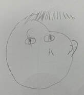
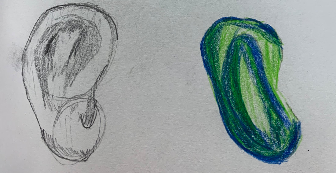
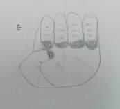
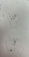
1. The warm up that helped me the most with my piece is the eye warm up. I learned how to add more detail to the eye to make it look more realistic rather than drawing just a circle. I learned how to shade it which gives the eye value. 2. I found how accurate the facial proportions were the most surprising.
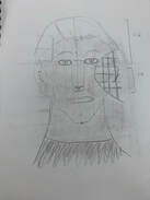
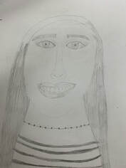
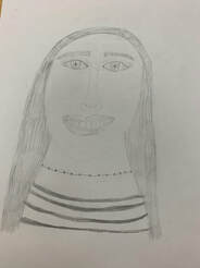
1. I did a portrait of my best friend Eden.
2. I used pencil for my medium. 3. I started off by drawing the general shape of the head then focused on the eyes and eyebrows. Then I drew the nose and the mouth. The last part I drew was the hair, neck, shirt, and necklace. 4. I think the eyes and the mouth are the most successful part about my piece. I think the shape of the teeth are realistic and the eyes have lots of detail. If I were to complete it again, I would have spend more tie with the hair and the shirt. I also would have done the face proportions a little more accurate since the forehead is very small. 1. Since the in-progress post, my box was fired. Then I painted it with acrylic paint and 2. I think the details are the most successful part of my piece. I think the fish, shell, sand dollar, and starfish turned out good. Each are a different color and stand out on the blue box. 3. If I were to do this again, I would have spent more time on adding details to the box. I would have added more to the top.
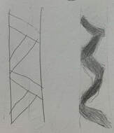
Sketch 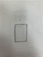 Linoleum Block 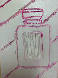 Finished Print 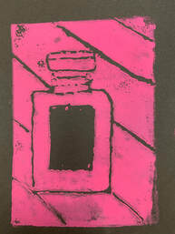 1. My piece shows the theme of line, because I added lines to the background. I like how the lines added more detail to the background.
2. I think the most successful part of my piece is the perfume bottle. I like how the "logo" in the middle is black and solid. I think it makes the bottle pop. I like the turn out of the background. I didn't mean for the splotches without ink to turn out. I think they look cool, but if I were to do it again I would try and make the background more solid. 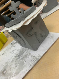 1. I plan to paint my piece with acrylic paint. I want to use bright
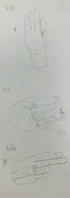
colors for the shells, the anchor, and the fish to make them pop. I will use more neutral colors for the lid and the outer areas. 2. I found it difficult to make the lid. It was hard to make a lid that would stay on. It was also difficult to make the anchor and attach it to the top of the box. 3. I think the most successful part of my box so far is the seashells and the fish on the sides. I like the detail I added to them. 4. First I chose measurements for my box and then rolled out a slab. I lined up my measurements with the clay and cut them out. Then I used the scratch and slip method to put the box together. I made my lid, then all my details. Watercolor Warm up
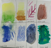
1. I found the watercolor technique activity the most helpful. It gave me lots of ideas and options for different techniques for my painting. 2. I like how there are so many unique techniques for watercolor. I think the final piece of a watercolor painting looks better than acrylic paint. 3. The most difficult part of watercolor for me is that you can't fix a mistake easily. It's easier when using acrylic paint, but it's harder with watercolor.
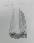
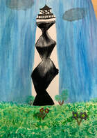
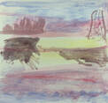
T1. I used one point perspective. 2. I took this photo a few years ago at Cape Lookout on a family beach trip. 3. Mistakes were hard to cover up. The colors easily ran together in the piece if I was not careful. When I added too much watercolor the paper would wrap and not lay flat. 4. The sunset warm-up helped me the most. When I painted the sky and the grass, I took what I learned from the warm-up and incorporated in my piece. The most helpful perceptive warm-up was the one that introduced all three perspectives. It helped me so I could decide which one I wanted to use for my piece.
|
AuthorWrite something about yourself. No need to be fancy, just an overview. Archives
May 2019
Categories |


 RSS Feed
